Maplin have discontinued the electricity monitor used here. Indeed, Maplin themselves have been discontinued. ☹️
I have a couple of these spare that I got for a bargain price when they were heavily discounted. If you are in the UK and would like one then get in touch. The absolute values aren’t terribly accurate (you need to sample voltage for this) but they are useful for showing relative electricity consumption and when you use most during the day.
This is ideal for seeing if you will save money with smart meter time-of-use billing, such as the innovative agile tariff from Octopus Energy (e.g. with the comparison tool I built). If you’d like to switch to them then use this referral link to get £50 off.
FIFTH UPDATE: I’ve added a new script (maplin2emoncms.py) to the repo which you can use to push the data to OpenEnergyMonitor emoncms.
FOURTH UPDATE: Here’s the video from my talk at the HN London meetup:
THIRD UPDATE: I gave a talk on this at HN London. Here are my slides:
SECOND UPDATE: I won a competition with this project: raspberrypi.org/blog/raspberry-pi-competition-results
UPDATE: Interactive example graphs now at jpsingleton.github.com.
I’ve built a system for monitoring the electricity consumption of my home with a Raspberry Pi.
I bought a wireless electricity monitor from Maplin. It’s one of the standard affairs which has a transmitter with a current clamp that you put around the main in-feed and a portable display unit. However, this unit has a serial connection (accessible via an RJ45 socket) which allows you to download live and historic data to a PC.
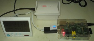
There are limitations though; the on-board memory only stores daily totals and the windows software that comes with it is awful. So I reverse engineered the communication protocol and built my own logger. A Raspberry Pi was a great choice for the host machine as it would be far too ironic to leave a power hungry PC on to monitor electricity consumption. I have a plug in power meter and have measured the draw of the whole system as negligible (barely a few watts). Here is the whole system (the Pi and receiver obviously don’t always have to be next to the transmitter). The cable was excessively long so I shortened it by crimping on a new plug.
Parts list (hardware):
- Maplin wireless electricity monitor
- Raspberry Pi
- Micro USB power supply
- SD card (mine is 32GB high speed but 2GB would be fine)
- WiFi adapter (optional; you could just plug it into your router)
- Case (optional; but it looks nice and stops shorts)
Software:
- Raspbian “wheezy” OS (raspberrypi.org/downloads)
- Python (included in OS)
- USB serial driver (included in OS)
- Apache web server (httpd.apache.org)
- pySerial (pyserial.sourceforge.net)
- Logger and display code (github.com/jpsingleton/Raspberry-Pi-Electricity-Monitor)
How to get up and running:
- Install the Apache web server with apt (
sudo apt-get install apache2) - Install pyserial.sourceforge.net with apt (
sudo apt-get install python-serial) - Download the repository from GitHub (github.com/jpsingleton/Raspberry-Pi-Electricity-Monitor)
- Copy the
wwwfolder to/var/www - Copy the python file to anywhere you want (e.g. home folder)
- Plug in the receiver (the USB serial driver should already be present)
- Execute
sudo python raspberry-pi-electricity-monitor.py &(add this to/etc/rc.localto run at boot) - Visit your Pi in a browser to see the data (visit
raw.htmlto see the noisy data)
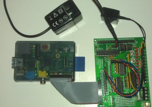
The system has a sample period of 7 seconds as the transmitter only broadcasts this often to save power. This still results in far too much data to render (after a few days) so the software filters out the noise to reduce the data points. Future plans include using the ADC and micro-controller on my self assembled Gertboard with my new Pi to achieve a much higher sample frequency.
FYI soldering zero ohm surface mount resistors is a real pain. Why Gert couldn’t have just used wire jumpers I don’t know.
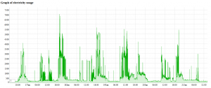
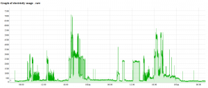
Below are some screen-shots of the graphs that are produced by the system. This first image shows the filtered data over 5 days.
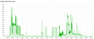
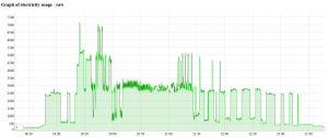
This next image shows a zoomed in portion of the 1st plot. You can see the thermostat in the oven on the left, an electric heater in the centre and the washing machine just after.
This is a raw version of roughly the same region with the noise shown.
Here it is zoomed in to a high usage region where the electric oven is in use.
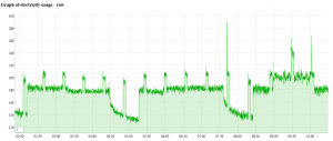
Here is a low usage region. You can clearly see the compressors of the fridge and freezer. Occasionally the inrush current of the motor shows up.
Thanks to dygraphs.com for an awesome library and raspberrypi.org for the great hardware.
P.S. The dygraphs library is also used at shutdownscanner.com (which is a service for monitoring how many computers have been left on out of hours). If you want to play with the interactive features of the graphs or see some of the more advanced interface options then take a look at the example dashboard.
