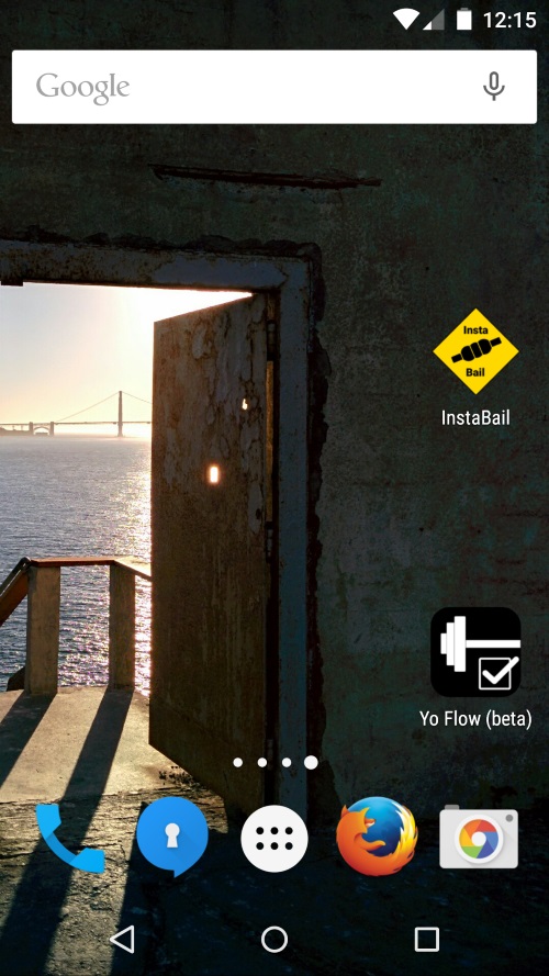
I briefly mentioned in the last post that home screen icons on iOS and Android need to be different. Android supports transparent backgrounds while iOS does not. So if you want to use a non-square shape on Android then you will need to create separate icons for iOS. If you don’t then iOS fills the background in black which looks rubbish. You can see how many different icons are needed in the GitHub repository for InstaBail.
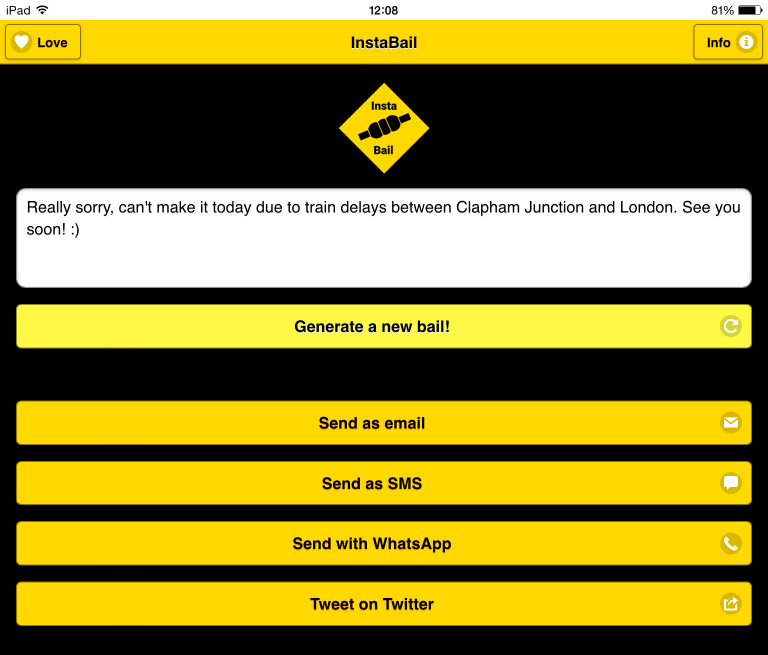
Here is what InstaBail looks like on iOS. The Apple icons aren’t transparent, they just have white borders on a white background.

Here is what it looks like on Android. For comparison the Yo Flow icon is square on both platforms.
How you set the text for the icon also varies by platform (and how many characters fit varies by the version of each platform too) but I’ll save that for another post.